BRAND IDENTITY
APPLICATION
DATE OF COMPLETION_08.22
CATEGORY_COMMERCIAL
CONTRIBUTION_100%
NEWYORKNINESTUDIOS
: A KOREAN CLOTHING BRAND ‘NEWYORKNINESTUDIOS’
︎︎︎ Discovering Simple Answers to Complex Questions
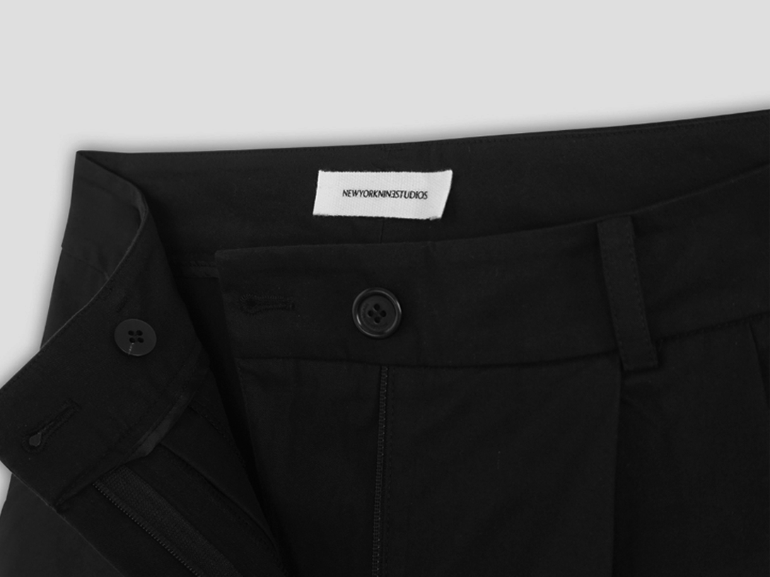
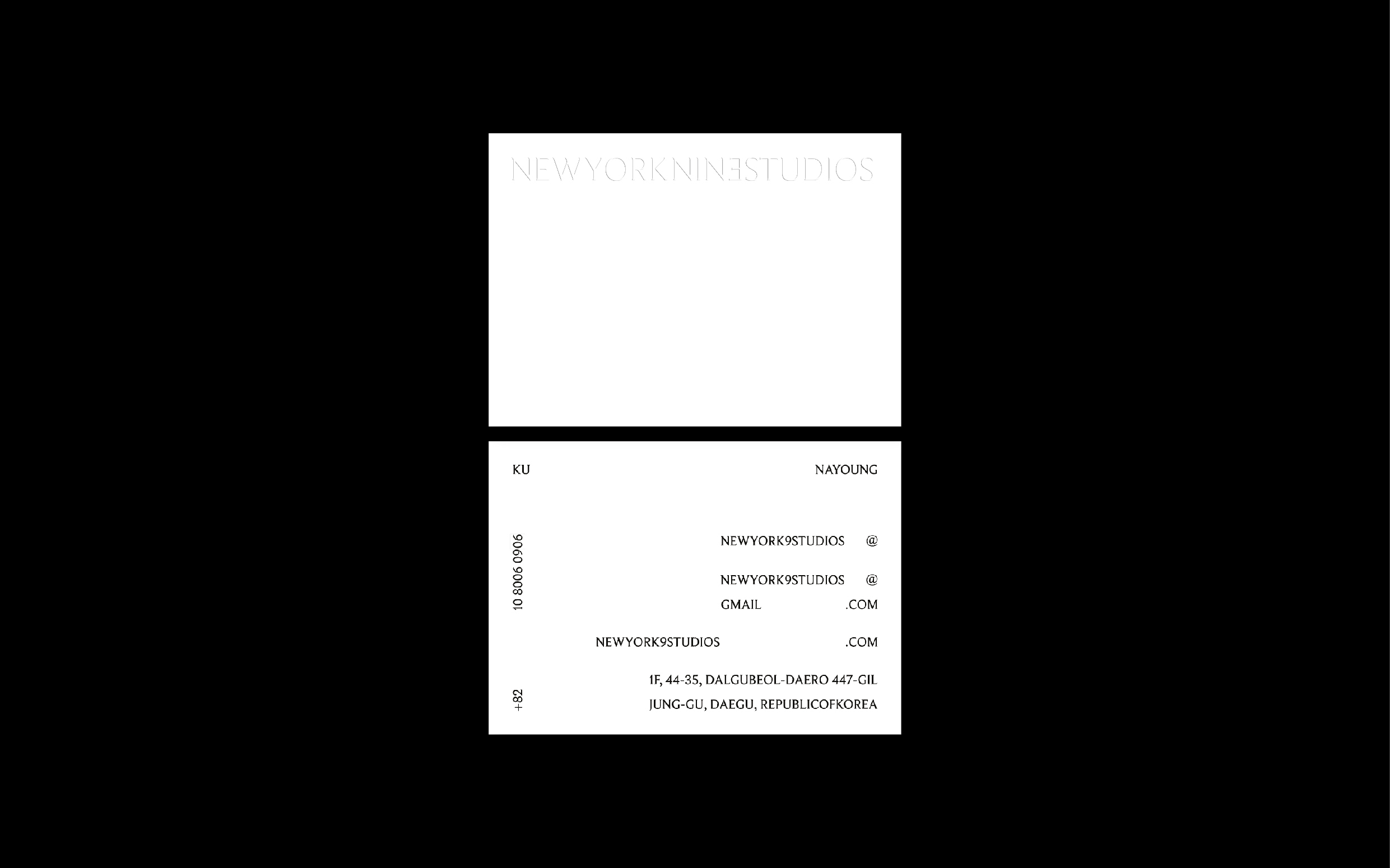
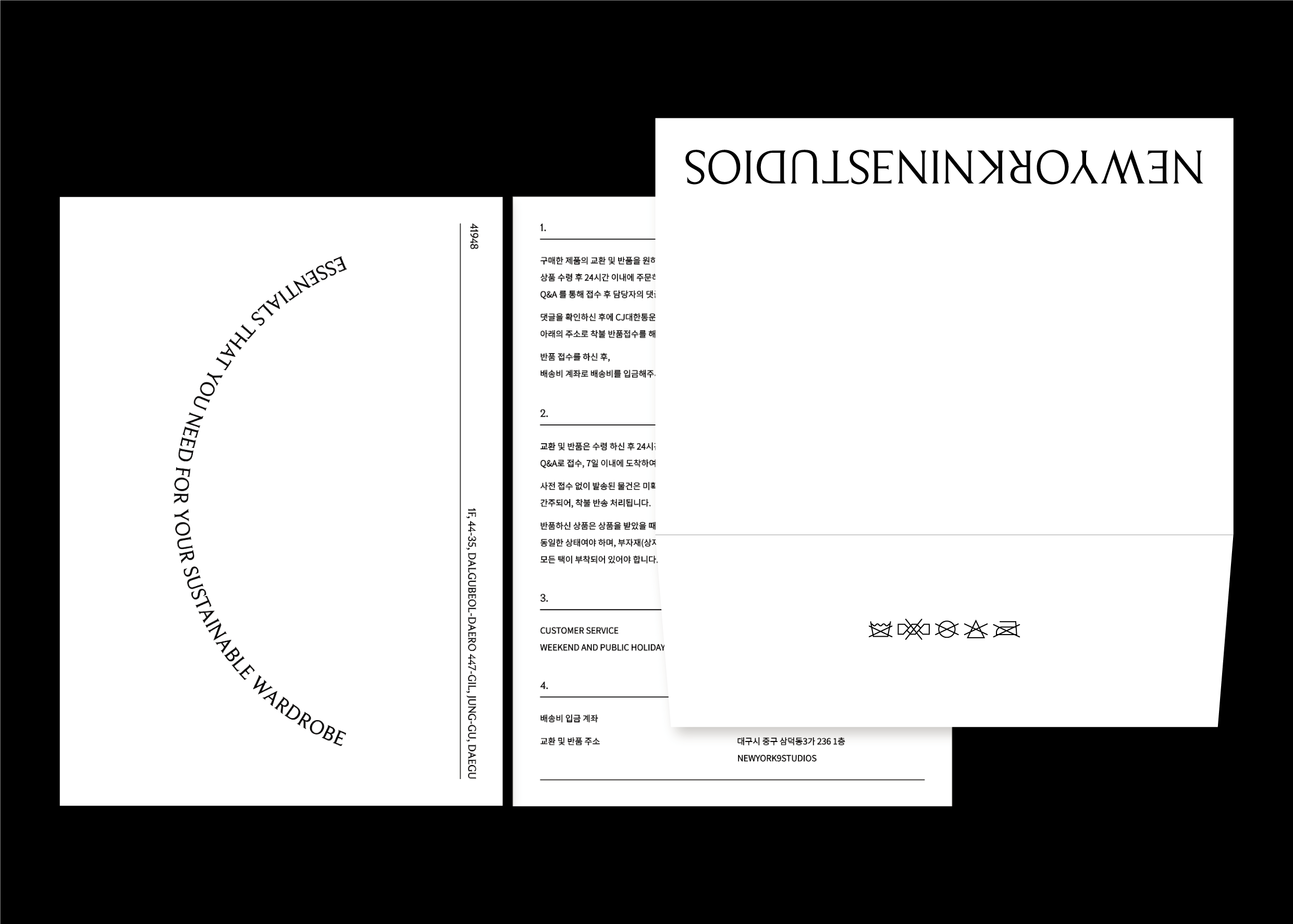
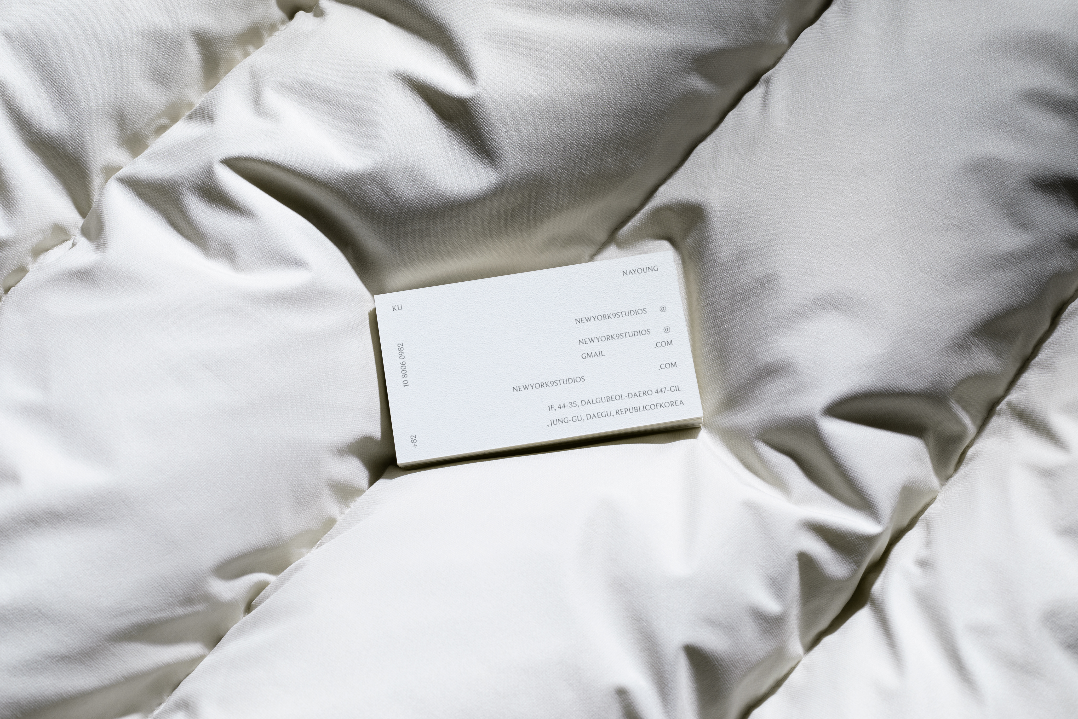
NEWYORKNINESTUDIOS is a Korean-based clothing brand. The brand identity design was executed with specific guidelines, including the use of only capital letters and serif fonts for the logo.
In designing the overall visual image, my aim was to cultivate a clean atmosphere that aligns with the brand’s core values - Essential, Fundamental, and Sustainable.
However, when I designed their logo, I was faced with the challenge of readability posed by the long brand name consisting of three capital words.
I addressed this matter by flipping the alphabet ‘E’ horizontally. This not only enhanced the logo’s readability but also conveyed the brand’s intention point ‘normal but essential’, bringing originality to the brand’s image.