BRAND IDENTITY
ART DIRECTION
APPLICATION
DATE OF COMPLETION_07.24
CATEGORY_COMMERCIAL
CONTRIBUTION_100%
ATT
: COSMETIC LIFESTYLE BRAND ‘ATT’
ATT is a men’s cosmetic brand launched in South Korea in 2024. The brand name “ATT” stands for “Attract Attention”, with the goal of offering all-in-one products that simplify complex skincare routines into a single solution.: COSMETIC LIFESTYLE BRAND ‘ATT’
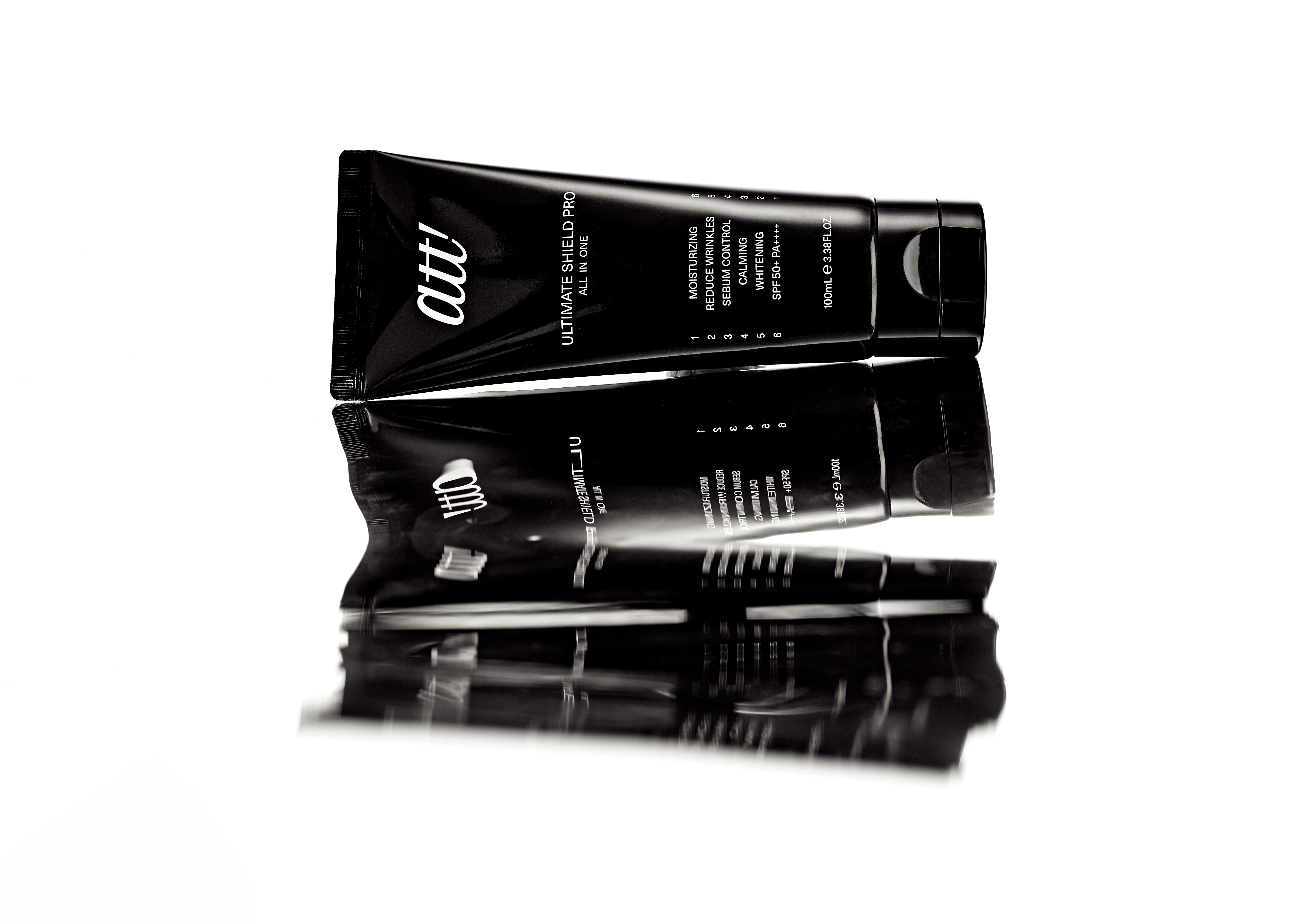
Analysis of the sales platform for ATT’s first product, Ultimate Shield Pro, revealed that 40% of male all-in-one skincare purchases are made by women. In response, ATT aimed to build a brand image that also appeals to female consumers. Unlike most men’s cosmetic brands on the platform, which rely on minimalist branding with sans-serif fonts, ATT stands out with an assertive logo combined with a minimalist layout.
This approach effectively communicates the brand’s core value of dynamism, as embodied in “Attract Attention”, while offering male consumers the familiar stability of conventional minimalism and positioning ATT as a more appealing option compared to competing products for female buyers.
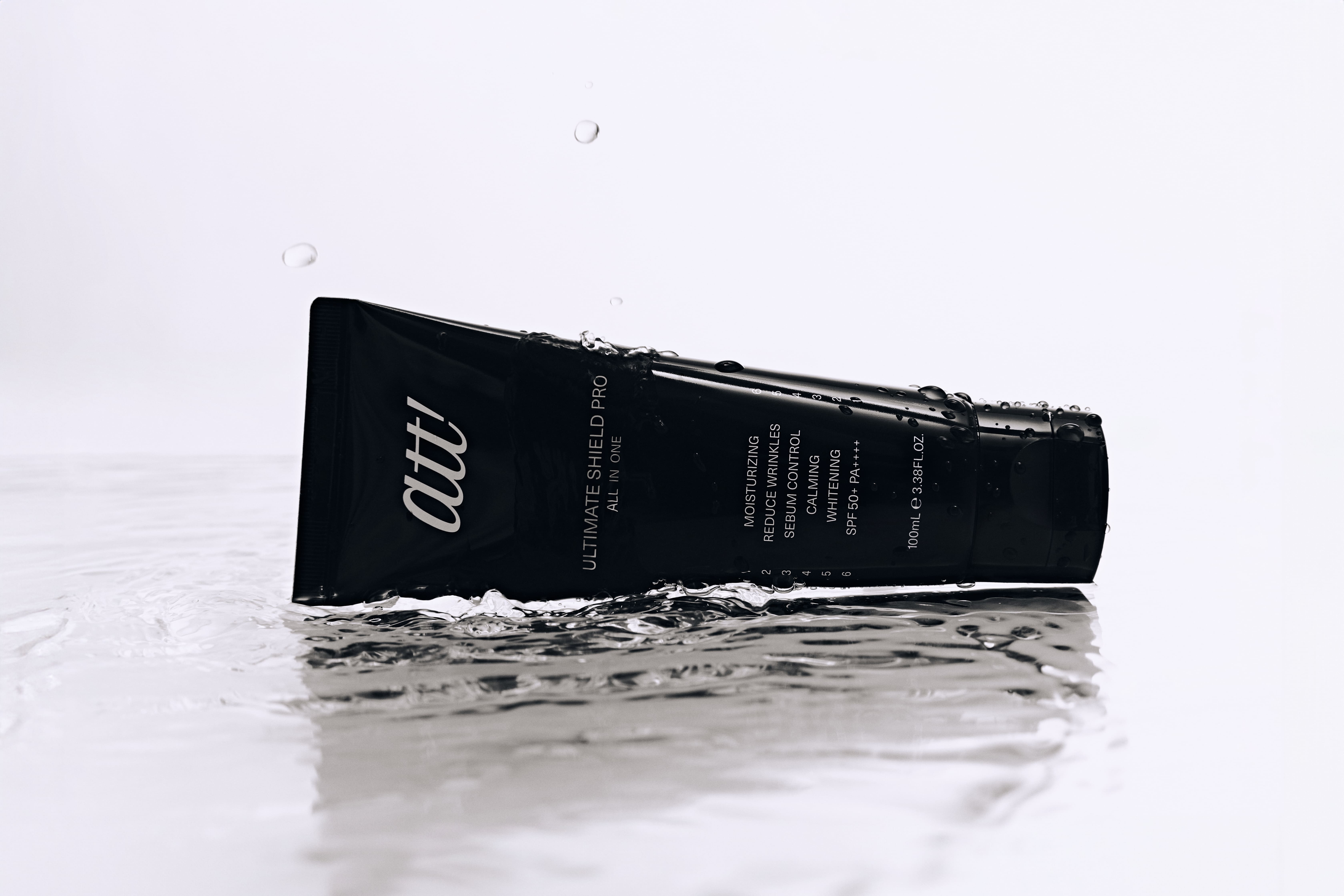
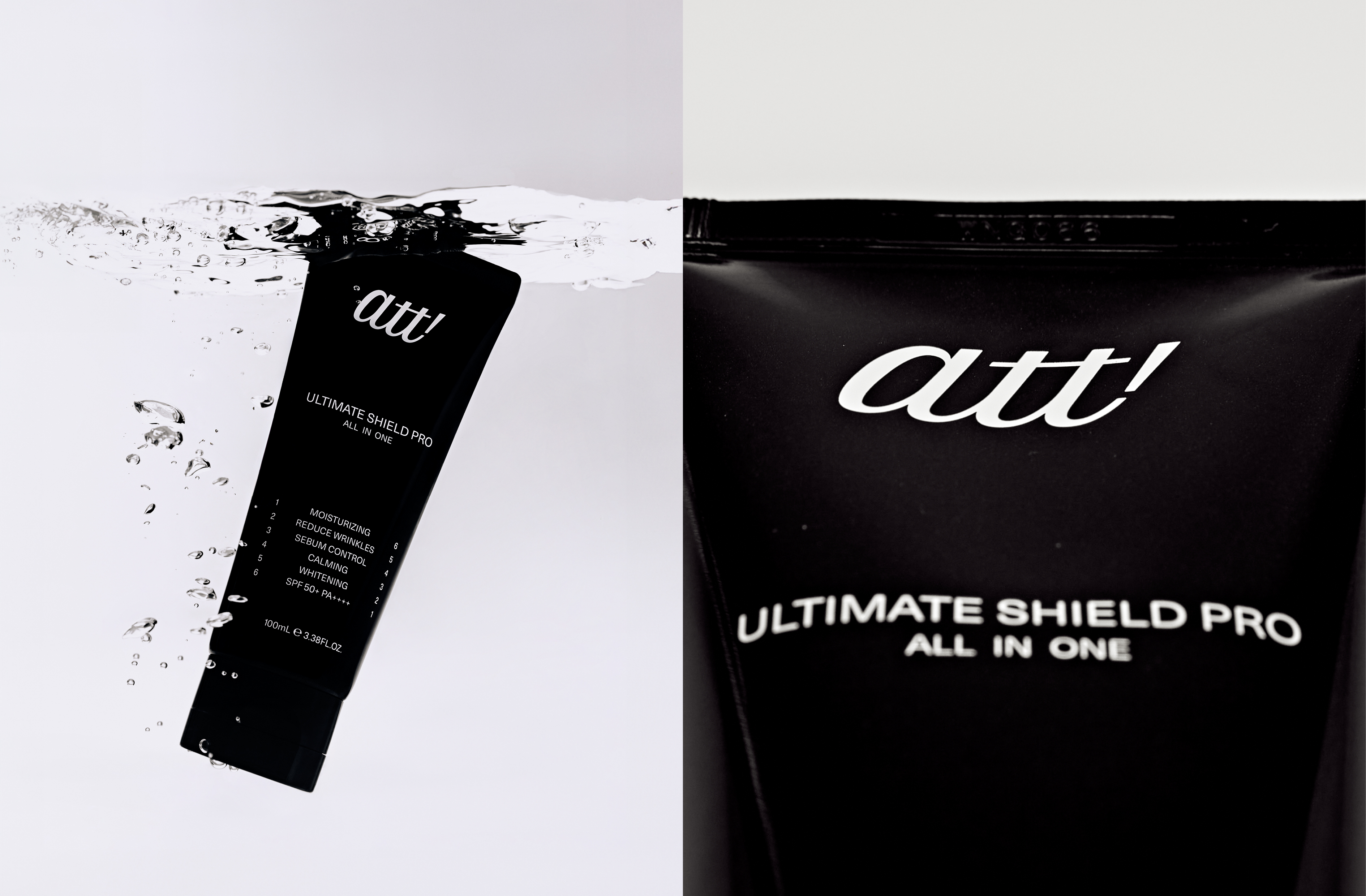
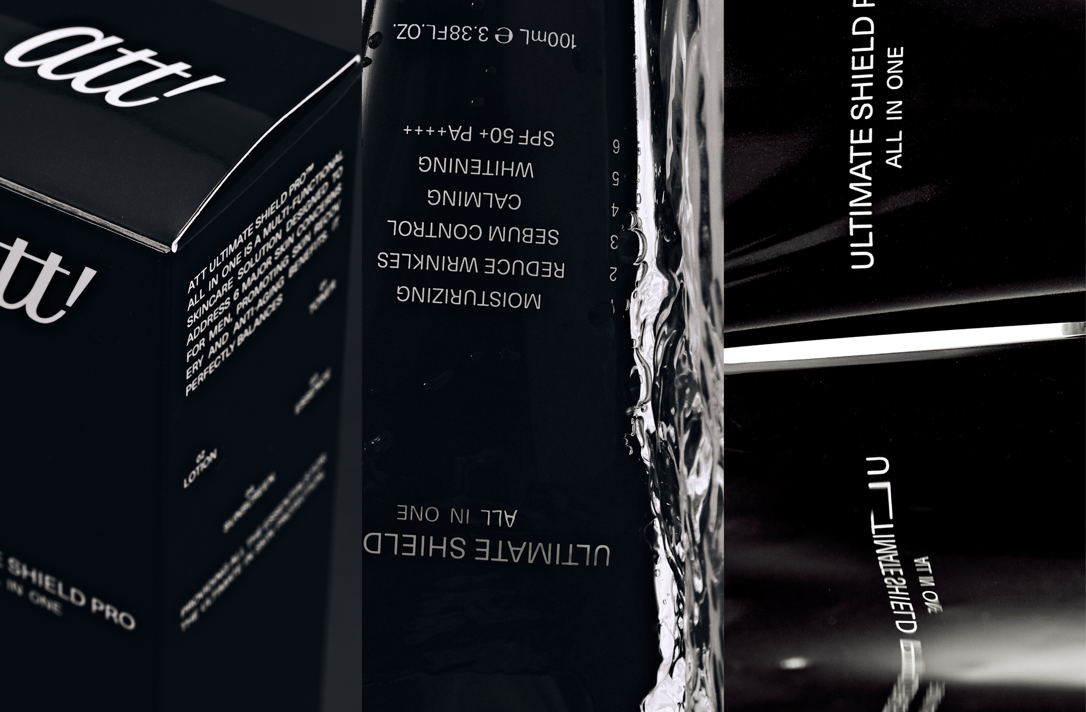
Furthermore, given that all-in-one cosmetics offer multiple benefits within a single product, ATT used numbering as a visual element on its packaging to intuitively communicate these features. Featuring both standard and reverse numbering, the design emphasizes the equal importance of each feature in a simple yet engaging way. This layout was designed to ensure consistency across future all-in-one product launches.
